Best Poster Presentation Templates for Quality Teams 2024

TL;DR: A poster presentation template is a pre-designed layout that helps researchers and professionals create visual presentations for conferences and events. It typically includes structured sections for title, abstract, methodology, results, and conclusions, with organized graphics and text blocks that ensure clear communication of research findings or project outcomes in a standard poster format.
Frequently Asked Questions
What is a poster presentation template?
A poster presentation template is a pre-designed layout used to create academic or professional posters for conferences, research presentations, or business meetings. It typically includes structured sections for title, introduction, methodology, results, conclusions, and references. Templates provide consistent formatting, proper dimensions (commonly 36x48 inches), and visual guidelines to help presenters communicate complex information clearly and professionally without starting from scratch.
How do I create an effective poster presentation template?
To create an effective poster presentation template, start with standard dimensions (36x48 or 48x36 inches), use a clear hierarchy with large titles (85-120pt), maintain consistent fonts throughout, and include designated sections for key content. Incorporate your branding or institutional colors, leave adequate white space for readability, use high-resolution images (300 DPI minimum), and ensure text is readable from 3-6 feet away. Include space for QR codes or contact information.
What are the key elements to include in a poster presentation template?
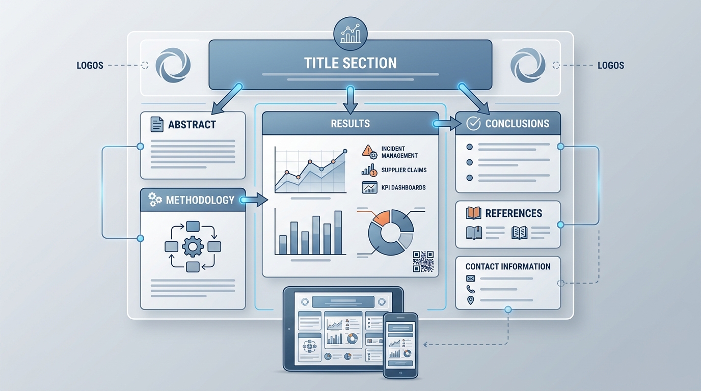
Essential elements in a poster presentation template include: a clear title section with authors and affiliations, an abstract or introduction area, methodology section, results with charts or graphs, conclusions and implications, references, and acknowledgments. Also include visual elements like your institution's logo, consistent color scheme, section dividers, and contact information. For quality management presentations, add spaces for KPIs, process flows, and data visualization dashboards.
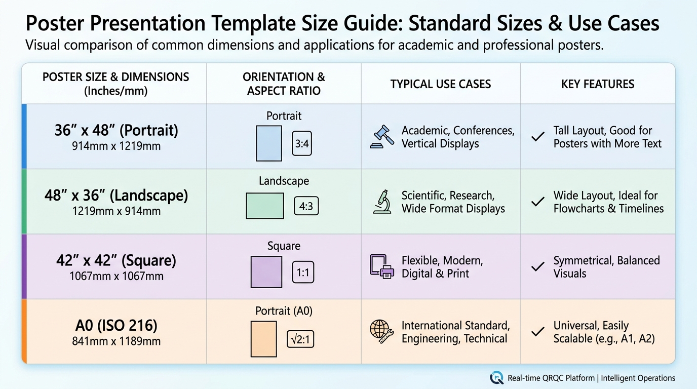
What size should a poster presentation template be?
Standard poster presentation templates are typically 36x48 inches (portrait) or 48x36 inches (landscape), though sizes vary by conference requirements. Academic conferences often prefer 42x42 inches or A0 size (33.1x46.8 inches). Always verify specific dimensions with event organizers before designing. Set your template resolution to 300 DPI for professional printing quality. Digital poster presentations may use 16:9 aspect ratios for screen display.
Can I use Canva or Word for creating poster presentation templates?
Yes, both Canva and Word offer poster presentation template options. Canva provides numerous pre-designed templates with drag-and-drop functionality, making it ideal for visually appealing posters without design expertise. Microsoft Word and PowerPoint also offer poster templates with customizable layouts. However, for professional printing, consider using Adobe Illustrator or InDesign for better resolution control and advanced design features. Canva's paid version supports high-resolution exports suitable for printing.
How do poster presentation templates help with quality management system presentations?
Poster presentation templates streamline quality management system (QMS) presentations by providing structured layouts for displaying KPIs, process improvements, and corrective actions. They enable clear visualization of Six Sigma results, QRQC incident data, supplier claims analysis, and integrated program management metrics. Templates ensure consistent formatting across multiple plant locations, making it easier to compare performance dashboards and communicate quality initiatives effectively during audits or management reviews.
What are the best practices for designing a poster presentation template for conferences?
Best practices include: using a single-column or two-column layout for easy flow, limiting text to 300-800 words total, using bullet points instead of paragraphs, maintaining font sizes of 24pt minimum for body text, incorporating high-contrast colors for readability, balancing text with visuals (40-50% graphics), including clear section headers, and leaving 20-30% white space. Test readability from 6 feet away and ensure your key message is visible in the top third of the poster.
Where can I find free poster presentation templates?
Free poster presentation templates are available on platforms like Canva, Microsoft Office templates library, Google Slides, and academic websites like PosterPresentations.com. Many universities provide institutional templates for students and researchers. Design resources like Freepik and Template.net offer downloadable options. For quality management or business presentations, specialized platforms may offer industry-specific templates. Always verify licensing terms and customize templates to match your specific conference requirements and branding guidelines.
Understanding Poster Presentation Templates: A Comprehensive Guide
In today's fast-paced business environment, effective visual communication is essential for sharing complex information quickly and clearly. A poster presentation template serves as a powerful tool for professionals across industries, from manufacturing quality managers presenting quality metrics to operations directors showcasing corrective action results. Whether you're displaying key performance indicators at a conference or documenting process improvements in your facility, the right template can transform raw data into compelling visual stories.
Professional poster presentations bridge the gap between detailed reports and quick visual summaries. They enable teams to communicate critical insights about quality management systems, lean and six sigma initiatives, and integrated program management strategies in formats that engage stakeholders and drive action.
This comprehensive guide explores everything you need to know about creating effective poster presentations, from selecting the right template to incorporating industry-specific content that resonates with your audience.
What Makes an Effective Poster Presentation Template
An effective poster presentation template combines visual appeal with functional design elements that guide viewers through your content logically. The best templates balance aesthetics with readability, ensuring your message reaches your audience without overwhelming them with information.
Essential Design Elements
Professional poster templates incorporate several key design principles that enhance communication effectiveness:
- Clear hierarchy: Visual weight guides viewers from title to conclusion naturally
- White space utilization: Adequate spacing prevents visual clutter and improves comprehension
- Consistent branding: Color schemes and typography align with organizational identity
- Logical flow: Information architecture supports intuitive navigation
- Data visualization: Charts and graphs transform complex metrics into digestible insights
Template Categories for Different Purposes
Different business contexts require specialized template approaches. Understanding which category fits your needs ensures maximum impact for your presentation.
| Template Type | Best Use Cases | Key Features |
|---|---|---|
| Research Presentation | Conference presentations, academic settings, technical reports | Abstract section, methodology display, results visualization |
| Business Dashboard | KPI tracking, performance reviews, quality metrics | Data-heavy layouts, chart integration, metric highlights |
| Process Improvement | Lean initiatives, Six Sigma projects, corrective actions | Before/after comparisons, process flow diagrams, timeline elements |
| Marketing/Promotional | Trade shows, product launches, brand awareness | Bold visuals, minimal text, strong call-to-action elements |
Creating Poster Presentations for Quality Management
For manufacturing quality managers and operations professionals, poster presentations serve as critical tools for communicating quality initiatives, incident responses, and continuous improvement results. A well-designed presentation can transform complex QMS quality management system data into actionable insights.
Displaying Key Performance Indicators Effectively
Understanding what are key performance indicators KPIs and how to present them visually is fundamental to creating impactful quality posters. KPIs are measurable values that demonstrate how effectively an organization achieves key business objectives.
When designing posters for quality management contexts, focus on these critical elements:
- Select KPIs that directly relate to your quality objectives and strategic goals
- Use visual indicators like gauges, trend lines, and color coding to show performance status
- Include comparative data showing progress over time or against benchmarks
- Highlight both leading indicators (predictive) and lagging indicators (historical performance)
- Provide context for numbers through annotations and brief explanations
Integrating Lean and Six Sigma Methodologies
Poster presentations documenting lean and six sigma projects require specialized layouts that showcase methodology, results, and sustainability plans. These templates typically incorporate DMAIC (Define, Measure, Analyze, Improve, Control) frameworks or lean value stream mapping elements.
Effective lean and six sigma posters include:
- Problem statement with baseline metrics clearly defined
- Root cause analysis visualizations using fishbone diagrams or 5-Why analysis
- Statistical data showing process capability improvements
- Cost savings or efficiency gains quantified with before/after comparisons
- Control plans outlining sustainability measures
Template Resources and Tools for Professional Posters
Creating professional poster presentations requires access to quality templates and design tools. While numerous options exist, selecting the right resources depends on your specific needs, technical capabilities, and budget constraints.
Digital Template Platforms
Modern design platforms offer extensive template libraries that streamline poster creation. For instance, a canva invoice template approach can be adapted for business poster layouts, demonstrating how versatile template platforms have become for various document types.
Popular template resources include:
- Professional design software: Adobe InDesign and Illustrator for advanced customization
- Online platforms: Canva, Visme, and Piktochart for user-friendly drag-and-drop design
- PowerPoint templates: Microsoft Office templates offering familiar interfaces
- Specialized scientific tools: LaTeX-based poster generators for technical presentations
Complementary Template Types
Professional environments often require multiple template types working together. Understanding how different templates complement your poster presentations enhances overall project documentation.
Consider these related template resources:
- Cover note template: Professional cover letters introducing your poster presentation at conferences or submissions
- To do list template: Project management tools tracking poster development milestones and review cycles
- Purchase order template in word: Procurement documentation for printing services or design software licenses
While these may seem unrelated to poster design, comprehensive project management often requires multiple document types. For example, creative projects might even include pumpkin carving templates print for seasonal corporate events or bubble letter template printable resources for informal team communications, demonstrating the breadth of template needs in modern organizations.
Implementing Integrated Program Management Through Visual Communication
For operations directors and supply chain professionals, poster presentations play a crucial role in integrated program management strategies. These visual tools facilitate cross-functional communication, align stakeholders around common objectives, and track progress across complex initiatives.
Multi-Plant Operations Coordination
Manufacturing quality managers overseeing multi-plant operations face unique challenges in standardizing communication across facilities. Poster presentation templates provide consistent frameworks for sharing best practices, incident reports, and quality metrics across geographic locations.
Effective multi-plant poster presentations include:
- Standardized layouts ensuring consistency across all facilities
- Comparative metrics showing performance differences between plants
- Best practice highlights from top-performing locations
- Common challenges and collaborative solution approaches
- Resource allocation and support requirements clearly identified
Supplier Quality and Claims Management
Supply chain professionals handling supplier quality issues benefit from poster templates that document claims, corrective actions, and supplier performance trends. These visual tools facilitate stakeholder meetings and drive accountability throughout the supply chain.
Key elements for supplier quality posters:
- Supplier performance scorecards with trend analysis
- Incident timelines showing response and resolution progress
- Root cause analysis results with supporting evidence
- Corrective action status updates with responsible parties identified
- Cost impact calculations showing financial implications
Best Practices for Poster Content Development
Creating compelling poster content requires more than just a good template. The information you include and how you present it determines whether your poster achieves its communication objectives.
Content Hierarchy and Information Architecture
Effective posters guide viewers through information systematically, with clear visual hierarchy directing attention to the most important elements first.
Follow these content organization principles:
- Title and objective: Clearly state what the poster communicates in 10 words or fewer
- Key findings first: Place your most important insights in prominent positions
- Supporting details: Provide context and methodology in secondary positions
- Visual emphasis: Use size, color, and positioning to create focal points
- Conclusion and next steps: End with clear takeaways and action items
Data Visualization Strategies
Transforming raw data into meaningful visuals is essential for effective poster presentations. The right chart type can make complex information immediately understandable, while poor visualization choices confuse viewers.
| Chart Type | Best For | Avoid When |
|---|---|---|
| Bar Charts | Comparing categories, showing changes over time | Displaying continuous data or relationships |
| Line Graphs | Trends over time, continuous data patterns | Comparing discrete categories |
| Pie Charts | Parts of a whole (limited to 5-6 segments) | Precise comparisons or multiple data series |
| Scatter Plots | Correlations between variables, distribution patterns | Simple category comparisons |
| Heat Maps | Intensity across two dimensions, pattern identification | Exact value communication |
Text Optimization for Readability
Poster presentations require concise, scannable text that communicates efficiently. Unlike detailed reports, posters should use bullet points, short sentences, and strategic white space.
Text best practices include:
- Limit body text to 300-500 words maximum for standard poster sizes
- Use bullet points rather than paragraphs whenever possible
- Select sans-serif fonts for better readability at distance
- Maintain font sizes of at least 24pt for body text, 36pt+ for headings
- Ensure high contrast between text and background colors
Digital vs. Print Poster Considerations
Modern poster presentations serve dual purposes, appearing both in physical spaces and digital environments. Understanding the requirements for each medium ensures your template works effectively across all contexts.
Print Poster Requirements
Physical posters require specific technical considerations to ensure professional results:
- Resolution: Minimum 150 DPI at final print size, preferably 300 DPI
- Color mode: CMYK color space for accurate print reproduction
- Bleed area: Extend backgrounds 0.125-0.25 inches beyond trim lines
- Safe zones: Keep critical content at least 0.5 inches from edges
- File format: PDF with embedded fonts for consistent reproduction
Digital Display Optimization
Digital posters for screens, websites, or virtual conferences require different technical specifications:
- Resolution: 72-96 DPI suitable for screen display
- Color mode: RGB color space for accurate screen rendering
- Aspect ratio: Consider standard screen ratios (16:9, 4:3) for presentations
- File size: Optimize images to balance quality with loading speed
- Interactive elements: Consider clickable areas or embedded links for digital contexts
Integrating Poster Presentations with Quality Management Systems
For organizations using comprehensive quality management platforms, poster presentations serve as visual summaries of system data and insights. These presentations transform detailed incident reports, corrective actions, and KPI tracking into accessible formats for stakeholder communication.
Real-Time Data Integration
Modern quality management systems enable dynamic poster creation with real-time data feeds. This approach ensures presentations always reflect current performance rather than static historical snapshots.
Benefits of integrated poster generation include:
- Automatic updates eliminating manual data entry and reducing errors
- Consistent formatting across all quality communications
- Rapid response capabilities for urgent quality issues
- Traceability linking poster presentations to source documentation
- Version control maintaining historical records of communications
From Spreadsheets to Professional Presentations
Many organizations still rely on spreadsheets and informal communication tools for quality management. Transitioning to integrated platforms with professional presentation capabilities transforms how teams communicate quality information.
Organizations moving beyond spreadsheets gain:
- Standardized templates ensuring consistent communication quality
- Automated data visualization reducing manual chart creation time
- Cross-facility comparisons with normalized metrics and benchmarks
- Mobile accessibility enabling field teams to share insights immediately
- Audit trails documenting communication and decision-making processes
If your organization is ready to replace spreadsheets and informal communication tools with a comprehensive quality management platform, explore how QRQC's industrial quality control software provides real-time incident management, supplier claims tracking, and KPI dashboards across all your facilities.
Advanced Poster Design Techniques
Taking your poster presentations from good to exceptional requires mastering advanced design techniques that enhance visual impact and information retention.
Color Psychology and Strategic Application
Color choices significantly impact how viewers perceive and remember your poster content. Strategic color application guides attention and reinforces your message.
Color strategy considerations:
- Brand consistency: Incorporate organizational colors maintaining brand recognition
- Functional color coding: Use consistent colors for status indicators (red for issues, green for success)
- Contrast optimization: Ensure sufficient contrast for accessibility and readability
- Cultural considerations: Account for color meanings in different cultural contexts
- Limited palette: Restrict to 3-5 main colors preventing visual chaos
Typography Hierarchy
Font selection and sizing create visual hierarchy that guides viewers through your content systematically.
| Element | Recommended Size | Font Weight |
|---|---|---|
| Main Title | 72-96pt | Bold |
| Section Headings | 48-60pt | Bold or Semi-Bold |
| Subheadings | 36-42pt | Semi-Bold |
| Body Text | 24-32pt | Regular |
| Captions/Notes | 18-24pt | Regular or Light |
Visual Balance and Composition
Professional designers use compositional principles to create visually balanced posters that feel organized and intentional.
Key composition techniques include:
- Rule of thirds: Position key elements along imaginary grid lines dividing the poster into thirds
- Symmetrical balance: Mirror elements across central axes for formal, stable presentations
- Asymmetrical balance: Use varied element sizes and positions creating dynamic visual interest
- Proximity grouping: Place related elements close together showing their relationships
- Alignment consistency: Use invisible grid lines ensuring elements align properly
Common Poster Presentation Mistakes to Avoid
Even experienced professionals make poster design mistakes that undermine their message. Recognizing these common pitfalls helps you create more effective presentations.
Content and Layout Errors
These frequent mistakes reduce poster effectiveness:
- Information overload: Including too much text or too many data points overwhelming viewers
- Poor hierarchy: Failing to establish clear visual priority among elements
- Inconsistent styling: Using multiple fonts, colors, or design styles creating visual confusion
- Inadequate white space: Cramming elements together reducing readability and visual appeal
- Low-quality images: Using pixelated or poorly cropped visuals undermining professionalism
- Missing context: Presenting data without adequate labels, legends, or explanatory text
Technical and Production Issues
Technical mistakes can ruin otherwise excellent content:
- Wrong color mode (RGB for print or CMYK for digital) causing color shifts
- Insufficient resolution resulting in blurry or pixelated output
- Missing bleed areas causing content to be cut off during trimming
- Non-embedded fonts leading to font substitution and layout changes
- Incorrect dimensions requiring last-minute resizing and reformatting
Measuring Poster Presentation Effectiveness
Understanding whether your poster presentations achieve their communication objectives requires systematic evaluation and feedback collection.
Quantitative Metrics
For digital posters or conference presentations, track these measurable indicators:
- View duration showing how long people engage with your poster
- Interaction rates measuring clicks, downloads, or inquiries generated
- Audience size counting total viewers or booth visitors
- Social sharing tracking how often content is shared or referenced
- Follow-up actions measuring concrete outcomes like meeting requests
Qualitative Assessment
Gather subjective feedback to understand poster impact:
- Conduct brief surveys asking viewers about clarity and usefulness
- Request peer reviews from colleagues before final production
- Document questions received indicating unclear areas
- Observe viewer behavior noting which sections attract attention
- Collect testimonials from stakeholders about decision-making impact
Future Trends in Poster Presentations
Poster presentation formats continue evolving with technological advances and changing communication preferences. Staying current with emerging trends ensures your presentations remain relevant and effective.
Interactive Digital Posters
Digital displays enable interactive elements transforming passive viewing into active engagement:
- Touchscreen interfaces allowing viewers to explore data in depth
- Embedded videos providing dynamic content beyond static images
- Clickable sections linking to detailed documentation or resources
- Real-time data feeds showing current performance metrics
- Augmented reality elements overlaying digital content on physical posters
Mobile-Optimized Formats
As mobile devices become primary viewing platforms, poster designs must adapt:
- Vertical orientations optimized for smartphone screens
- Responsive layouts adjusting to different screen sizes automatically
- Simplified designs prioritizing key information for small displays
- Swipeable sections enabling sequential information revelation
- Mobile-friendly file formats ensuring fast loading and smooth viewing
AI-Assisted Design
Artificial intelligence tools are beginning to streamline poster creation:
- Automated layout suggestions based on content type and volume
- Intelligent color scheme generation matching brand guidelines
- Data visualization recommendations selecting optimal chart types
- Content summarization extracting key points from detailed reports
- Accessibility checking ensuring designs meet inclusivity standards
Conclusion: Elevating Your Quality Communication
Effective poster presentation templates serve as powerful tools for communicating complex quality management information across organizations. From displaying key performance indicators to documenting lean and six sigma improvements, well-designed posters transform data into actionable insights that drive continuous improvement.
For manufacturing quality managers, operations directors, and supply chain professionals, mastering poster presentation design enhances stakeholder communication, facilitates cross-functional collaboration, and supports data-driven decision making. Whether you're tracking quality metrics across multi-plant operations or documenting supplier corrective actions, professional poster presentations ensure your message reaches and resonates with your audience.
The most effective organizations integrate poster presentations with comprehensive quality management systems, creating seamless workflows from incident detection through visual communication and stakeholder engagement. This integration eliminates manual data entry, ensures consistency across facilities, and enables real-time performance tracking.
If you're ready to transform your quality management communication from spreadsheets and informal tools to professional, integrated solutions, visit QRQC's industrial quality control platform to discover how real-time incident management, supplier claims tracking, and comprehensive KPI dashboards can revolutionize your operations. Learn more about our approach on the QRQC About page or explore additional insights on our quality management blog.
Start creating poster presentations that don't just display information—they drive action, facilitate improvement, and support your organization's quality excellence journey.
Article created using IntentRank